Objective 📌
* To create an engaging & user-centric website that attracts new customers,
* Converts existing WordPress plugin users to the Dokan SaaS solution,
* Highlights the benefits for different types of businesses, and drives sign-ups.
1. Introduction 👋
Dokan, a leading multi-vendor marketplace solution powered by WooCommerce, has served over 50,000+ businesses worldwide. With the launch of their SaaS platform, the goal was to design a marketplace website that tells the story of this transition, showcases its value, and effectively communicates its business benefits.
2. Target Audience 🎯
- Small business owners
- Entrepreneurs
- Established businesses seeking customized solutions
3. Key Design Challenges 🎨
- Migration Drive: Encouraging the existing 50k+ WordPress plugin user base to transition to the SaaS platform.
- Interactive Motion Design: Implementing smooth drag-and-drop animations and interactive motion elements across key sections.
- Engagement Retention: Ensuring the website remains visually exciting and information-rich without overwhelming the user.
4. Solutions Implemented 🚀
- A vibrant UI with a focus on clarity and playfulness.
- Trendy UX patterns ensuring easy navigation and intuitive flow.
- Data-driven illustrations and numeric highlights to simplify complex information.
- Motion-infused sections that guide user attention effectively.
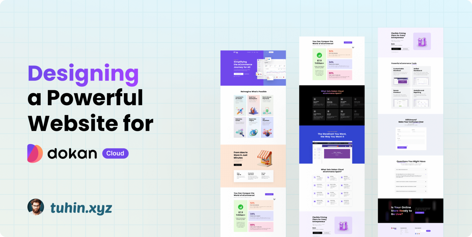
5. Highlighted Features and Sections 🔥
- Hero Section: A bold and clear message with engaging visuals sets the tone for the SaaS platform.
- Feature Blocks: Each block uses bespoke illustrations and concise text to explain core platform capabilities.
- Success Metrics Section: Eye-catching numeric data emphasizes the impact and credibility of the solution.
- Pricing Section (“Flexible Pricing Plans for Every Entrepreneur”): This section uses dynamic scrolling effects, allowing users to explore different plans seamlessly.
- Interactive FAQ Section: Clear, expandable FAQs address common concerns and encourage informed decision-making.
- Call-to-Action (CTA): The final section urges users to take action with a bold headline and a clear signup button.
6. I am proud of The Section
I’m proud of designing the “Flexible Pricing Plans for Every Entrepreneur” section. With smooth scrolling animations, users can effortlessly switch between Basic, Pro, and Custom plans, making pricing exploration intuitive and engaging. This section adds significant value by simplifying choices and enhancing user interaction.
7. Design Impact and Results 📊
While measurable results are yet to be observed post-launch, the design sets a strong foundation for user engagement and conversion. Early impressions suggest increased user curiosity and seamless interaction across the website.
8. Lessons Learned 💡
- Importance of balancing motion and functionality.
- Clear messaging combined with illustrations drives stronger user understanding.
- Intuitive navigation encourages longer site engagement.
9. Conclusion 👉
This website serves as a strategic bridge between Dokan’s plugin legacy and its future as a SaaS powerhouse. The design reflects innovation, clarity, and user-first thinking, ensuring Dokan remains at the forefront of the multi-vendor marketplace industry.
10. Final Thoughts ✍
A well-designed SaaS website isn’t just about aesthetics—it’s about crafting an experience that tells a story, builds trust, and drives action. The Dokan SaaS website achieves precisely that.
Where eCommerce Meets Innovation.
Leave a Reply