Rebranding isn’t just about changing a logo—it’s about growth, clarity, and connection. WooCommerce, a leading eCommerce platform, has introduced a fresh new look with a redesigned logo and branding. This update reflects its evolving vision and commitment to innovation.
Why Rebranding Matters
Brands must evolve to stay relevant. WooCommerce’s rebranding isn’t just aesthetic—it enhances clarity, coherence, and motion, aligning with its long-term goals. Many companies, like Airbnb and Slack, have made similar moves to strengthen their brand presence and engage customers better.
The Meaning Behind the New Logo
A logo is more than a symbol; it tells a story. WooCommerce’s new logo highlights motion and progress. The two ‘O’s resemble wheels, symbolizing movement and eCommerce growth. The deep purple shade reflects creativity and ambition, giving WooCommerce a polished and professional look.
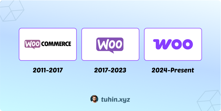
WooCommerce’s Logo Evolution
- 2011-2017: A playful logo with a speech bubble, emphasizing its community-driven nature.
- 2017-2023: A cleaner, refined version while retaining the speech bubble.
- 2024-Present: A bold, modern typography-based logo with dynamic ‘O’s, symbolizing eCommerce’s ever-evolving nature.
This transformation marks WooCommerce’s journey from a simple plugin to a global eCommerce powerhouse.
The Iteration Journey Behind the Redesign
I know that a designer’s mind eagerly seeks iterations from this early sketching stage. Actually, Woo aimed to evolve while keeping its fun, joyful spirit—mature but not corporate, playful but not cartoonish. The internal design team explored sketches, from speech bubbles to commerce icons, finally uncovering a hidden shopping cart in their name.
The internal design team explored sketches, from speech bubbles to commerce icons, finally uncovering a hidden shopping cart in their name.
They considered three approaches:
- Update – Refining the logo.
- Upgrade – Strengthening one element.
- Change – A bold redesign.
The first two felt too safe, so they went for a full transformation. Community feedback shaped the final design, which debuted at WooSesh. The rollout continues—stay tuned!
Maintaining Brand Consistency
WooCommerce’s new brand guidelines include:
- Logo usage: Rules for proper display.
- Color palette: Consistent color schemes.
- Typography: Defined fonts for a unified look.
- Spacing and layout: Ensuring proper visual balance.
Following these ensures a cohesive and recognizable brand identity.
Final Thoughts
WooCommerce’s rebranding signals its next chapter—more refined, future-focused, and ready for growth. As designers, we know the power of branding in shaping perceptions and trust.
What do you think of WooCommerce’s new branding? Let’s discuss!


Leave a Reply