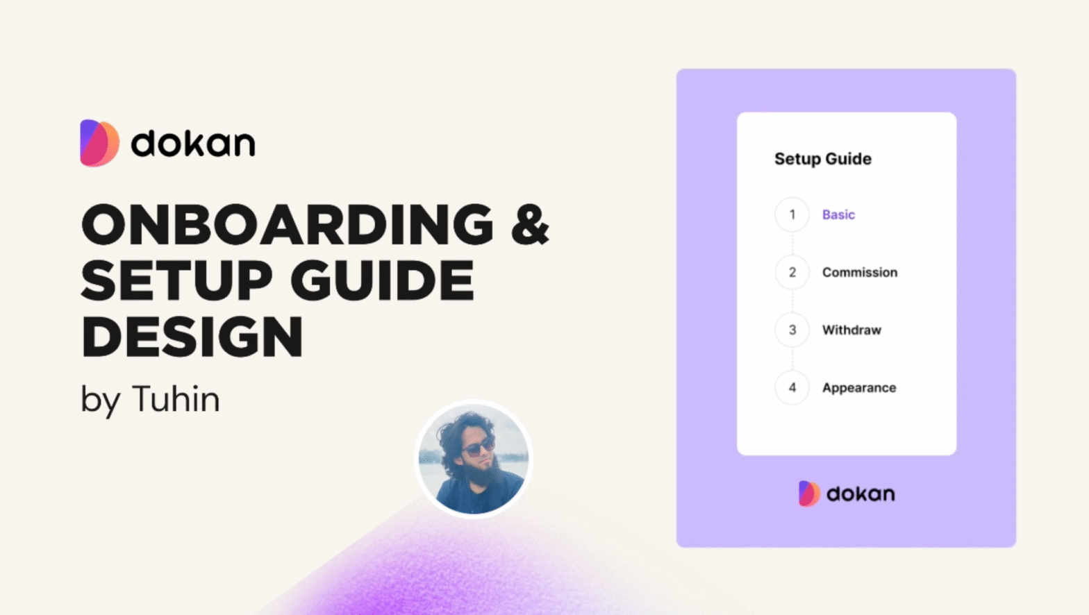
Onboarding sets the tone for any marketplace. If new vendors struggle to sign up or configure their stores, they’ll likely drop off – a costly loss for marketplace owners . In our latest Dokan update, we tackled this head-on by overhauling the onboarding and setup guide interfaces. The goal was clear: modernize the UI and streamline the flow, so new users can start selling in days, not weeks . By replacing cluttered screens with a progressive, step-by-step wizard, we aim to reduce friction and earn users’ trust from first click.
Why a Better Onboarding Matters
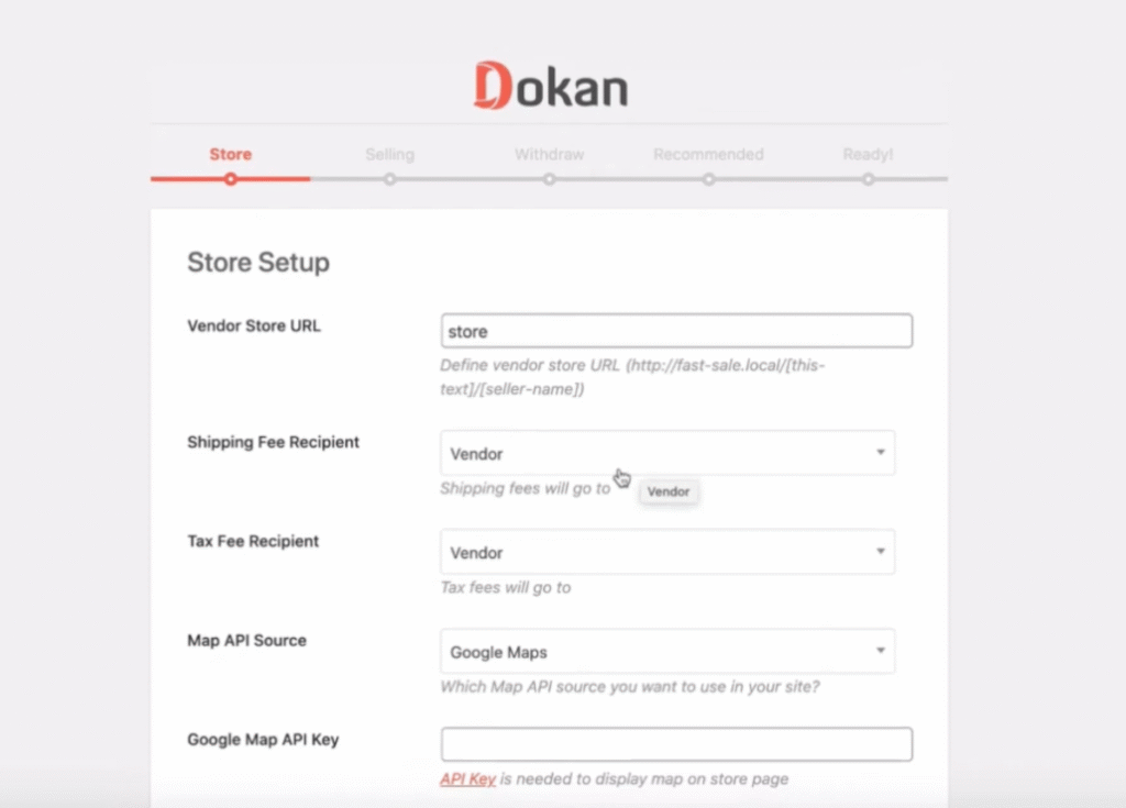
Poor onboarding drives frustration and churn. In fact, research shows sellers want to list products quickly (in days, not weeks), and lengthy sign-up processes cause them to quit. In the old Dokan flow, a long, outdated form and lack of guidance meant many users stalled or abandoned setup. A dated interface also undermines credibility: studies find that 75% of users judge a site’s trustworthiness by its design, and a cluttered or outdated UI can scare users away before they even start . In short, an outdated UI was holding back conversions and user confidence.
Say goodbye to the outdated UI: We replaced the old screens with a fresh, cohesive design that reflects modern standards. A clean, consistent look signals professionalism and builds trust .
Experience a cleaner, modern interface: Simplified navigation, updated color schemes, and clear iconography make every step feel intuitive. This declutters the experience so users can focus on what matters – selling.
Enjoy a smoother, more intuitive setup flow: We broke the process into digestible steps with a visible progress indicator. This wizard-like guide reduces user anxiety by showing exactly where they are and what’s next .
UX Pain Points in the Old Design
The previous onboarding flow had several issues:
- Long, Unfriendly Forms: Too many fields shown at once made the process overwhelming.
- Lack of Guidance: Users had to guess what was required, often leading to errors.
- Inconsistent Styling: Colors, fonts, and layouts were outdated and mismatched.
- Long Progress Feedback: Normally users couldn’t wait here much, leading to frustration.
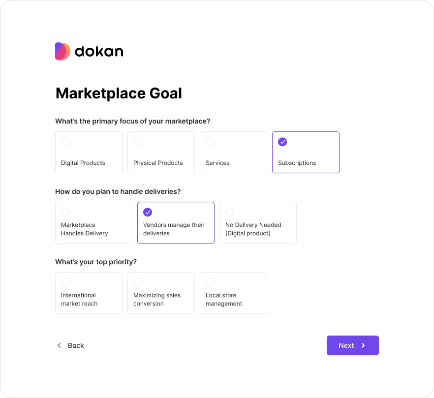
Designing the New Onboarding Experience
We redesigned the onboarding with three goals in mind: simplify, guide, and modernize.
- Step-by-step Wizard: The process is now broken into smaller steps. Vendors complete account basics, store details, payment, and shipping settings one at a time.
- Progress Indicator: A visible progress bar shows exactly where the user is in the process.
- Inline Validations: Helpful tooltips and real-time checks prevent errors.
- Consistent Visuals: Unified colors, typography, and button styles make the flow feel professional and cohesive.
- Responsive Design: Works smoothly on desktop, tablet, and mobile.
Challenges During the Redesign
Every redesign comes with its own set of challenges. For this project:
- Balancing Simplicity and Functionality: We had to collect essential vendor details without overwhelming them. The solution was prioritizing key fields and hiding advanced options under “More settings.”
- WordPress & WooCommerce Constraints: Since Dokan runs inside WordPress, we had to ensure compatibility with themes and plugins while keeping performance fast.
- Consistency Across Admin and Vendor Flows: Both the vendor onboarding and admin setup guide had to feel unified, so we designed a shared component system.
Key UX Improvements
- Guided, step-by-step onboarding wizard.
- Shorter and cleaner forms.
- Immediate feedback with error handling.
- Clear progress indicator to reduce drop-off.
- Modern interface with updated design standards.
- Contextual help and tooltips for better guidance.
- Mobile-friendly responsive design.
Conclusion
The redesigned Dokan onboarding and setup guide is now live and already creating impact. Vendors can quickly configure their stores, marketplace owners get higher engagement, and the overall experience feels modern and trustworthy.
This case study proves that even familiar workflows can be transformed with thoughtful UX design. By addressing real pain points and applying best practices, we’ve created a smoother journey for both admins and vendors.
The result? A stronger onboarding funnel, happier vendors, and more successful marketplaces.
To test the overall design and ensure a smooth development process, please download the latest version of Dokan and install it on your local or active site.
You can also see it to the dribble.
Leave a Reply